Page 3 of 7
Re: Updating Magic Set Editor
Posted: Thu Dec 06, 2018 1:08 am
by USMCgeek
Updated Minion Resource after initial color correction test (Added more blue to show).
I like this version better - but will still be subject to further color corrections.
- MinionResourceCompare_v2.png (1.41 MiB) Viewed 9724 times
Re: Updating Magic Set Editor
Posted: Thu Dec 06, 2018 2:08 am
by CCG Collector
It's better than the first one (less grey), but I feel purple is the primary color in minion resources, not blue, and that's not really coming through even in the updated one.
Re: Updating Magic Set Editor
Posted: Thu Dec 06, 2018 3:37 am
by USMCgeek
I'll try some more purple. I'm at home now, so I only have my inkjet, so I can't really test the results until tomorrow.
Re: Updating Magic Set Editor
Posted: Thu Dec 06, 2018 5:41 am
by Kjeld
I agree that a touch more purple (i.e. more red) would be good. Also, have you tried giving the frame a bit of texture? It seems to me that the original cards have a bit of texture to the minion frame, as though the metal were pitted a bit with corrosion (the way old wrought iron looks, sort of).
Re: Updating Magic Set Editor
Posted: Thu Dec 06, 2018 5:51 am
by USMCgeek
I'll check on texture. The print quality was pretty fuzzy so it's slightly difficult to tell what was intentional texture vs poor quality. I'll bust out the magnifying glass again!
Sent from my SM-G950U using Tapatalk
Re: Updating Magic Set Editor
Posted: Thu Dec 06, 2018 9:49 pm
by USMCgeek
Okie Dokie: More color work. Need a vote....
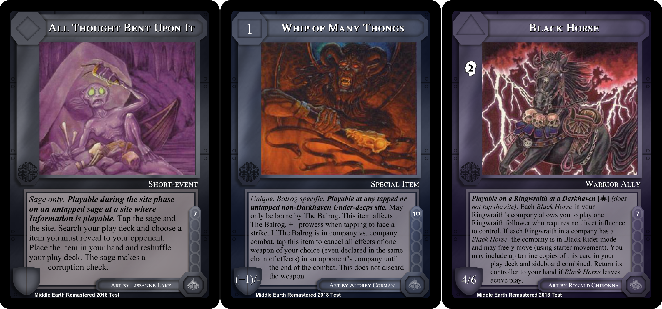
- MinionResourceCompareVote.png (1.66 MiB) Viewed 9705 times
Re: Updating Magic Set Editor
Posted: Thu Dec 06, 2018 9:59 pm
by Kjeld
I vote for color option on the right, represented by the Black Horse card. My reasoning is that more contrast is generally better, which in this case is the option that is furthest from the dark gray color of hazards.
Re: Updating Magic Set Editor
Posted: Thu Dec 06, 2018 10:03 pm
by Kjeld
On a completely different note, one thing that's always bugged me about the design is the slight overlap of the artwork with the frame in the upper left-hand corner. I find it slightly jarring that the artwork sits in front of the frame, which seems to be accentuated in your remastered versions. Was that intentional? Would it look better if the artwork were behind the frame in that corner? Otherwise, is there a way to add a slight border to the artwork there? I know it's a nitpick, but since we're on the topic of remastering everything, I thought I'd better mention it!
Re: Updating Magic Set Editor
Posted: Thu Dec 06, 2018 10:04 pm
by nico21000
imo Black Horse is the best, even if I'd personally like a little bit more purple.
Re: Updating Magic Set Editor
Posted: Thu Dec 06, 2018 10:14 pm
by nico21000
Kjeld wrote: ↑Thu Dec 06, 2018 10:03 pm
On a completely different note, one thing that's always bugged me about the design is the slight overlap of the artwork with the frame in the upper left-hand corner.[snap]
You're right. Even real cards have this defect. Setting the illustration on a lower layer would fix it, but would bring the opposite issue for at least one card I have in mind :
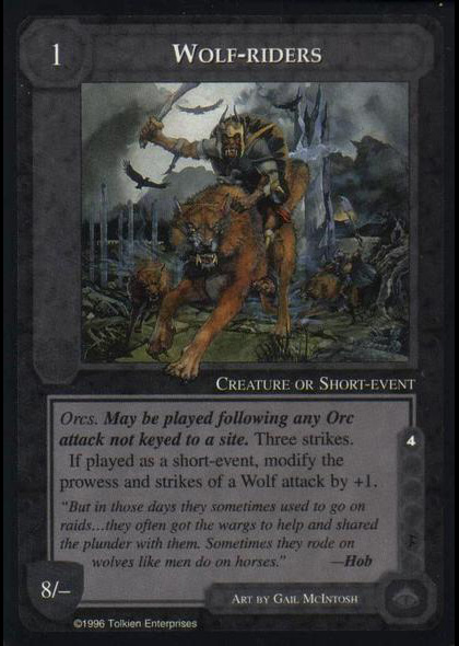
- metd_wolfriders.jpg (102.87 KiB) Viewed 9701 times
Re: Updating Magic Set Editor
Posted: Thu Dec 06, 2018 10:38 pm
by USMCgeek
*In terms of the image overlap - No, that's just how it is at the moment. Since these cards are not made in Photoshop, the option of placing the layer lower is not available. These are all made in MECCG Set Editor and exported as images. That's why I'm able to so quickly complete these cards. People that opt to work in Photoshop can produce cards without that overlap.
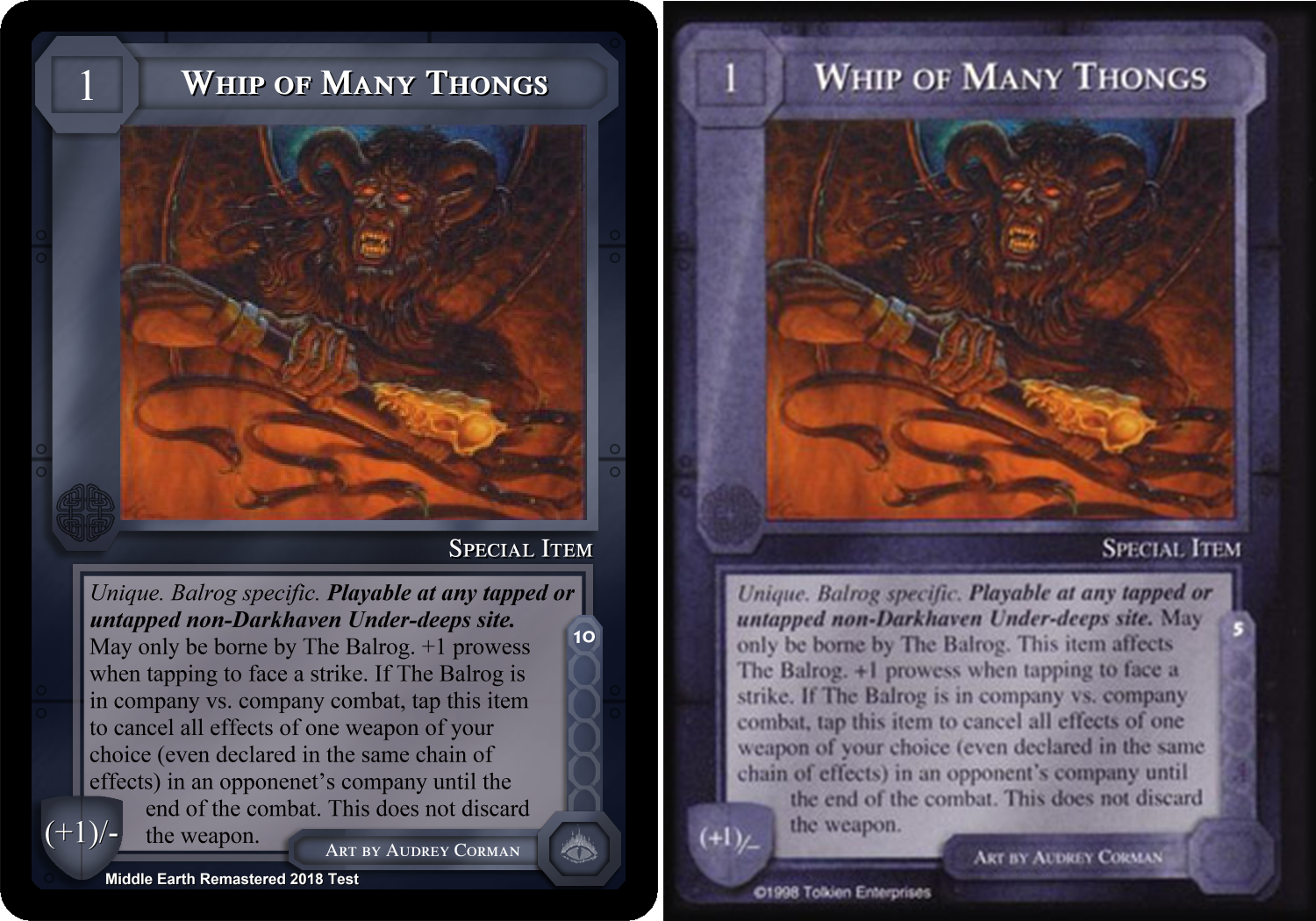
Ok - the purple it is. I won't add more until I do further Print Runs for color corrections. I'm settling for a middle of the road between all the printings. And they go from Blue to Purple. Plus the documents back up that the Minion card is a "Blue-Steel" design.
Now - Kjeld mentioned some texture - so here is a comparison (No Texture vs Texture):
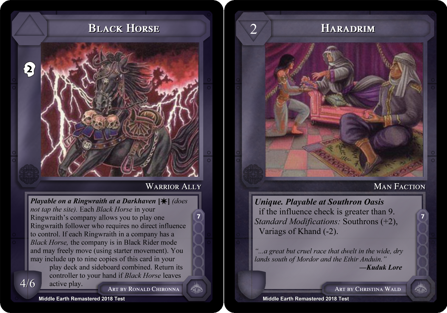
- No Texture (Left) vs Texture (Right)
- MinionResourceNoTextureVSTexture.png (1.25 MiB) Viewed 9699 times
Re: Updating Magic Set Editor
Posted: Thu Dec 06, 2018 10:47 pm
by nico21000
I personally love the soft grainy style. It's purely subjective, but it mixes rather well with the illustration grain. Even if I'll offer updated and improved scanned illustrations later I won't be able to get something better than the original material, which is grainy, especially for almost all cards that weren't 'upgraded and re-released' in the 10 official ICE challenge decks.
Re: Updating Magic Set Editor
Posted: Thu Dec 06, 2018 10:55 pm
by CCG Collector
nico21000 wrote: ↑Thu Dec 06, 2018 10:14 pm
Kjeld wrote: ↑Thu Dec 06, 2018 10:03 pm
On a completely different note, one thing that's always bugged me about the design is the slight overlap of the artwork with the frame in the upper left-hand corner.[snap]
You're right. Even real cards have this defect. Setting the illustration on a lower layer would fix it, but would bring the opposite issue for at least one card I have in mind : metd_wolfriders.jpg
Is that really the actual card? Do other cards have image overlap like the wolf's paw in that one?
Re: Updating Magic Set Editor
Posted: Thu Dec 06, 2018 11:10 pm
by nico21000
CCG Collector wrote: ↑Thu Dec 06, 2018 10:55 pm
Is that really the actual card? Do other cards have image overlap like the wolf's paw in that one?
Yes, it's the real card. The only other '
semi-official' card that I have in mind is 'Turukulon's Lair' from the ALEP additional sites & scenarios.
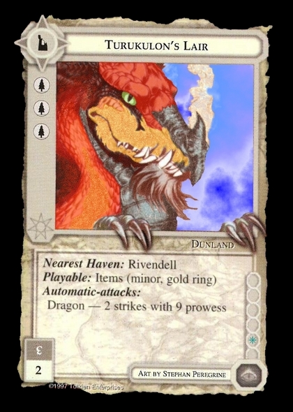
- TurukulonsLair.jpg (174.24 KiB) Viewed 9693 times
It's a colorized version but I can confirm that the original sepia card has overlapping claws. And so, the scans that you may find at various other places (cardnum among others) are 'incorrect'.
Re: Updating Magic Set Editor
Posted: Thu Dec 06, 2018 11:27 pm
by USMCgeek
Ok, initial dry run off my ink jet shows nice comparison results. Waiting to finish more templates before I order another print run to test. (Included the Elflord and Dragonlord just for fun)
***EDIT - Please remember my goal is not to perfectly replicate existing cards - I've only recreated them right now for testing purposes so I can compare in a pretty manner - because I'm slightly OCD....***


Sent from my SM-G950U using Tapatalk

